This QuickStart is part of a series designed to instruct new users how to use Sigma Dashboards, combining learning from previous QuickStarts and going further still.
This QuickStart assumes you have already taken the "Fundamentals 1: Getting Around" QuickStart and are now familiar with Sigma's user interface (UI). Given this, some steps are assumed to be known and may not be shown in detail.
We will be working with some common sales data from our fictitious company ‘Plugs Electronics'. This data is provided to you automatically. We will look at sales data, but throughout the course of other QuickStarts will incorporate more sources from associated store, product, and customer data.
The other "Fundamentals" QuickStarts explore topics such as working with Tables, Pivot Tables, Visualizations and more. We have broken these QuickStarts up so that they can be taken in any order you want, except the "Getting Around" QuickStart should be taken first and this QuickStart last.
Target Audience
Sigma combines with the unlimited power of the cloud data warehouse and the familiar feel of a spreadsheet; no limit on the amount of data you wish to analyze. Sigma is awesome for users of Excel and even better for customers who have millions of rows of data.
Typical audience for this QuickStart is users of Excel, common Business Intelligence or Reporting tools and semi-technical users who want to try out or learn Sigma. Everything is done in a browser so you already know how to use that. No SQL or technical skills are needed to do this QuickStart.
Prerequisites
- A computer with a current browser. It does not matter which browser you want to use.
- Completion of the QuickStart "Fundamentals 1: - Getting Around"
- Access to your Sigma environment. A Sigma trial environment is acceptable and preferred.
- If have not already, you can sign up for a Sigma Trial here:
What You'll Learn
Through this QuickStart we will build a Dashboard, building on previous Fundamental QuickStarts content. We will learn how to place Elements on the Dashboard Page, move them around, resize them and add Controls to enhance and filter the Dashboard.
What You'll Build
We will be working with some common sales data from our fictitious company ‘Plugs Electronics'. This data is provided to you automatically.
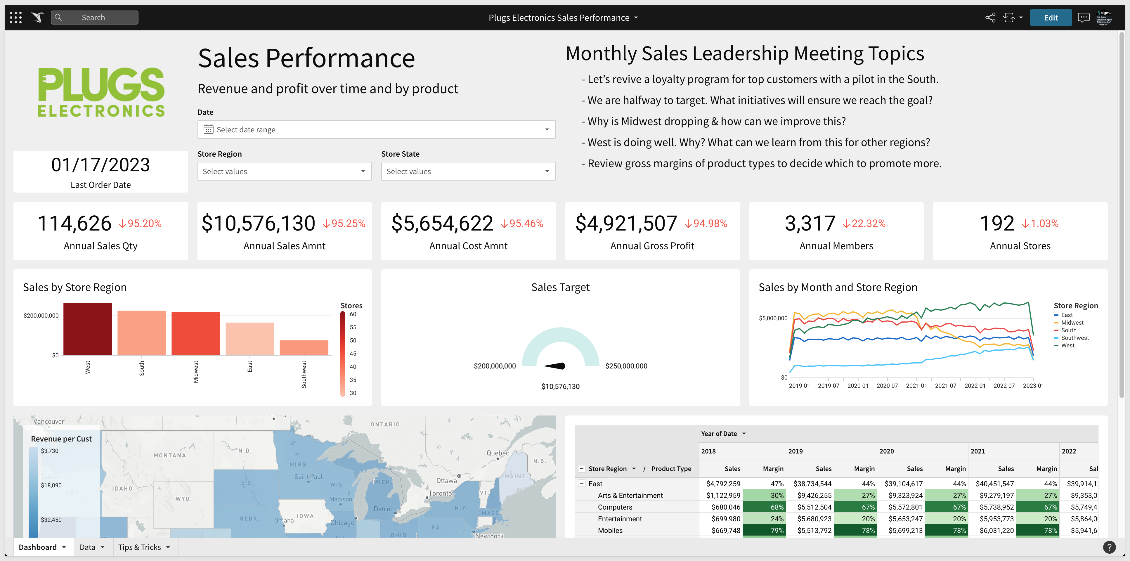
We will build a Dashboard that looks like this:

Dashboards are a great way to show and share a set of Elements that are meant to be looked at together. This could be a high level executive summary down to a very specific set of visualizations to analyze a specific part of the business. In this QuickStart we will use the work from the previous module to assemble a dashboard.
In this QuickStart the viewers can drill into the dashboard to explore the underlying data powering it, but optionally the dashboard could be "locked down" so end viewers cannot drill through the dashboard to underlying data.
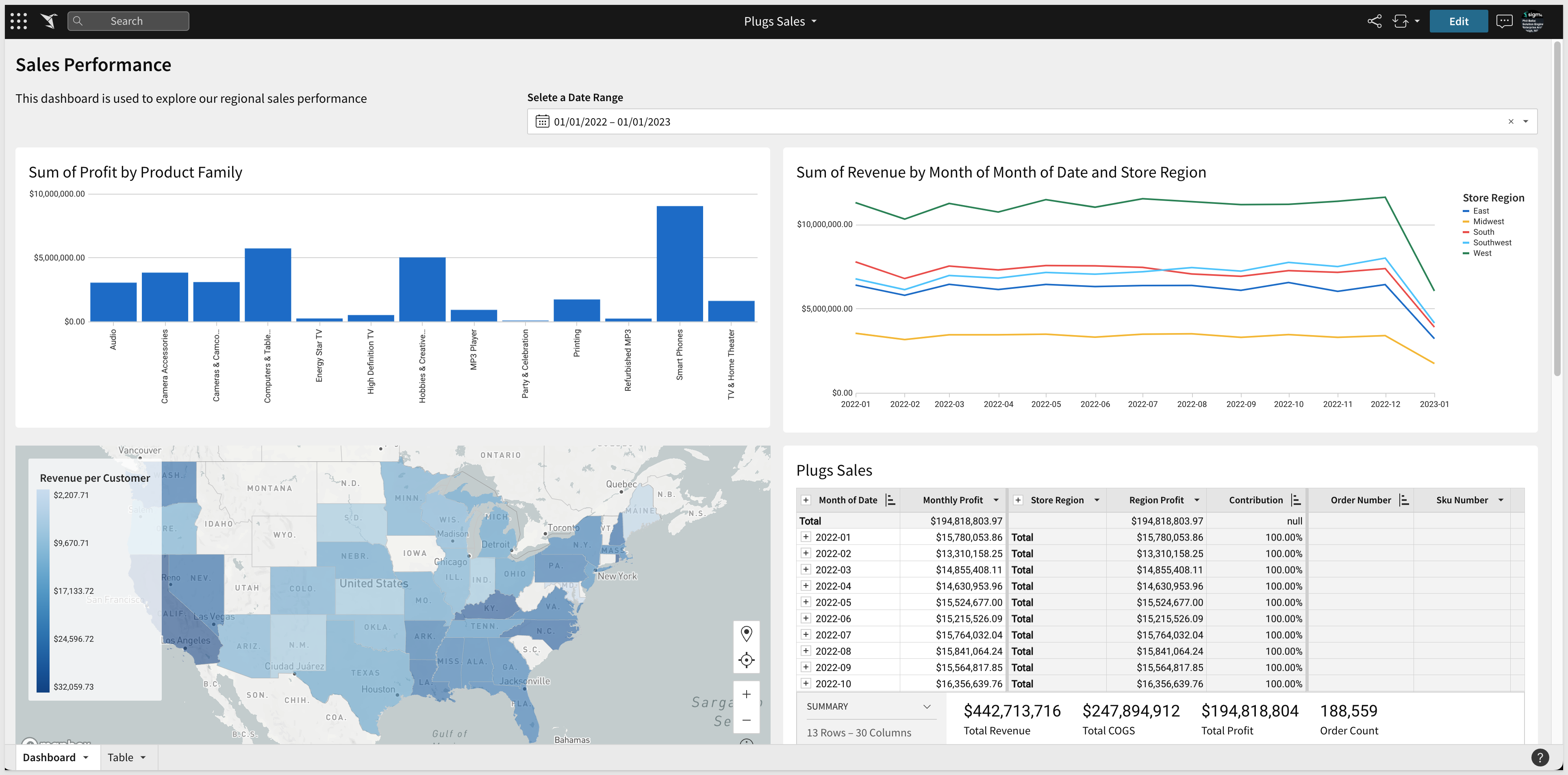
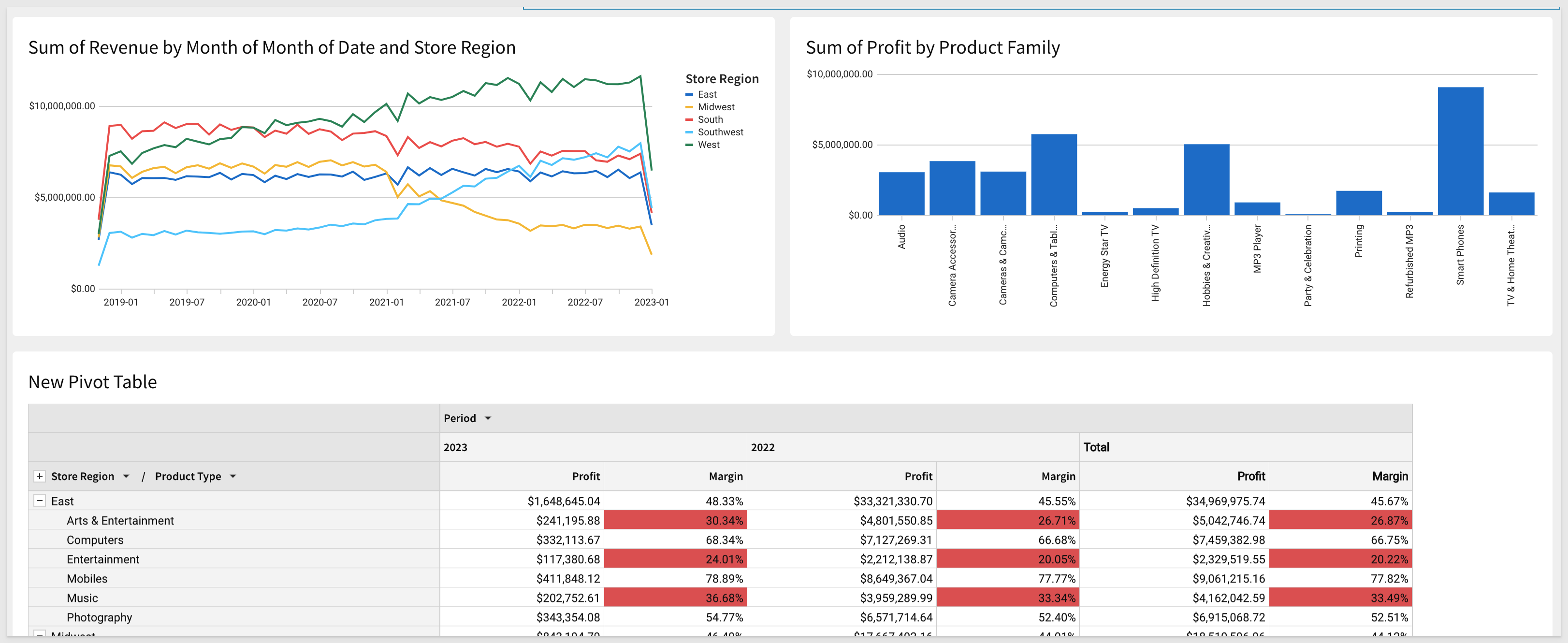
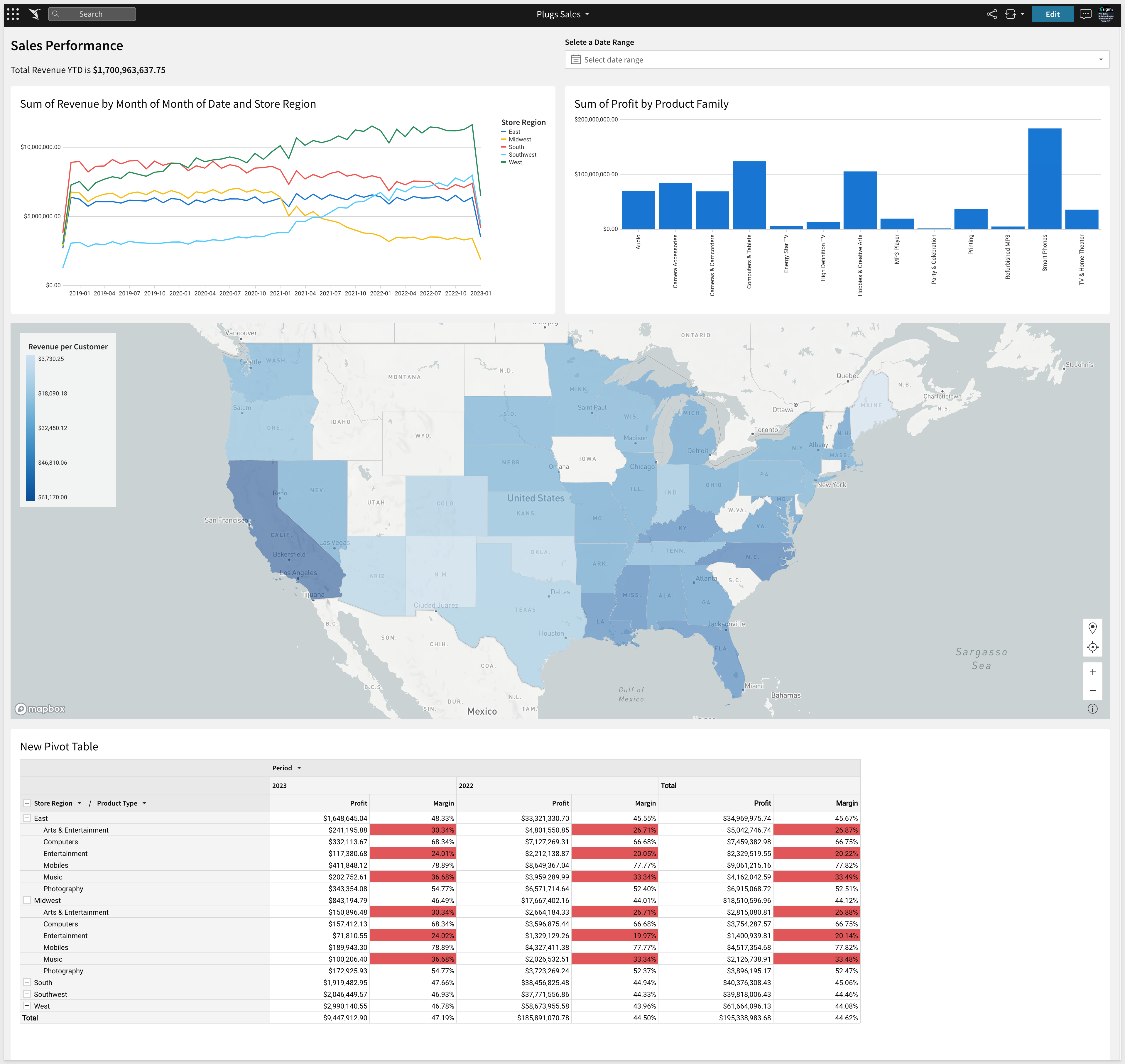
A fully built Dashboard has been provided to you as part of your Sigma Trial. It is called Plugs Sales Performance and looks like below. In the other QuickStarts we have built examples of many of the Elements shown and putting them all together will be easy!
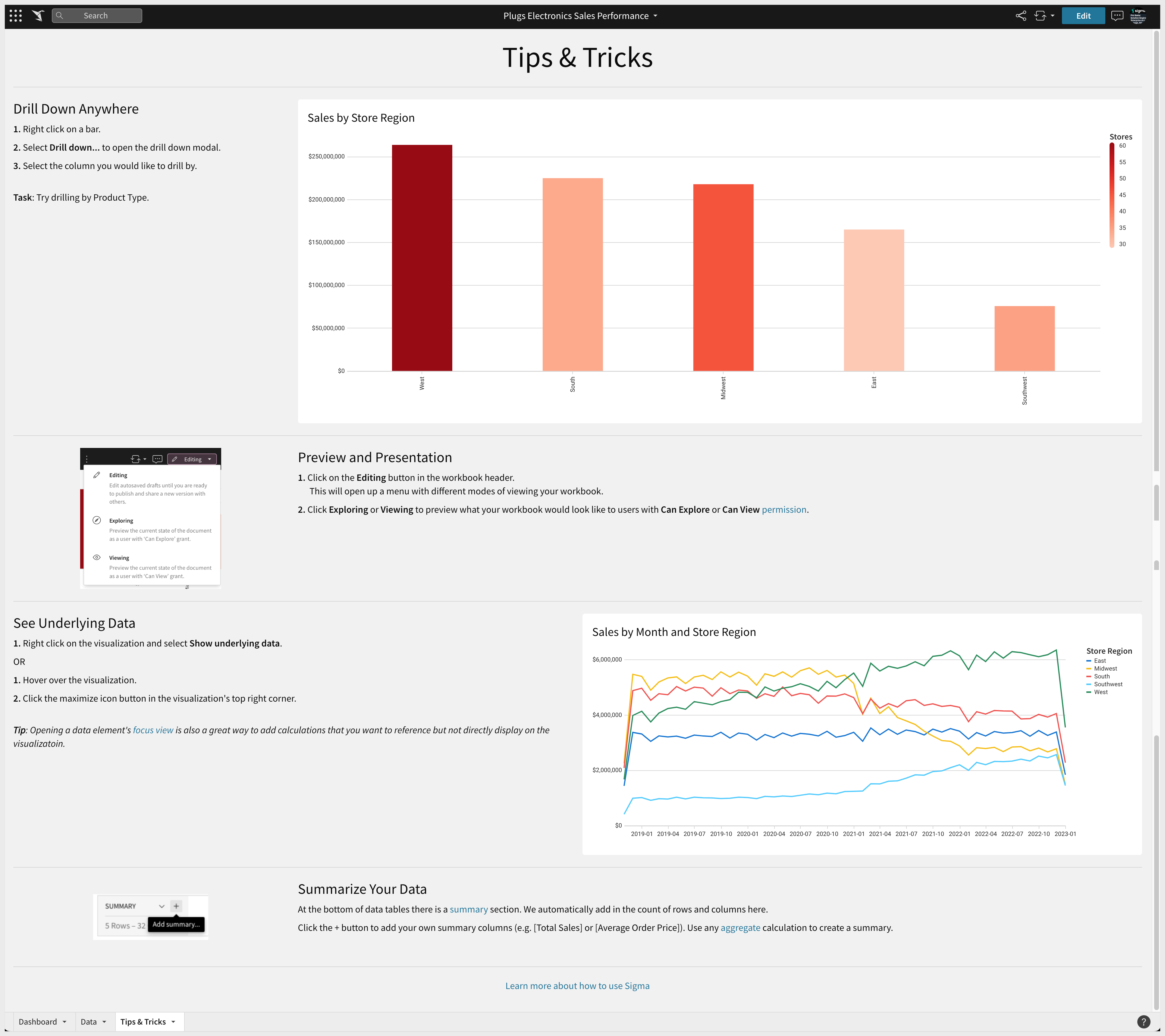
It is also considered a best practice to include a Workbook Page with information about the Dashboard along with anything else that the user may want to know about the way the data is represented (ie: data is refreshed every 15 min). For example, including a Workbook Page called "Tips and Tricks" like below will help the user know some simple but useful things.
Our starting point is the "Plugs Sales" Workbook created and built upon during the other QuickStarts. By reusing this Workbook, you should be able to leverage the Elements you already built into your Dashboard.
In Sigma, open the Workbook "Plugs Sales" and place it in edit mode. If you completed the other "Getting Started" QuickStarts you will have a few Pages as below. We are going to consolidate the Elements we built onto a new Page called Dashboard.
Create a new Workbook Page and rename it to Dashboard.
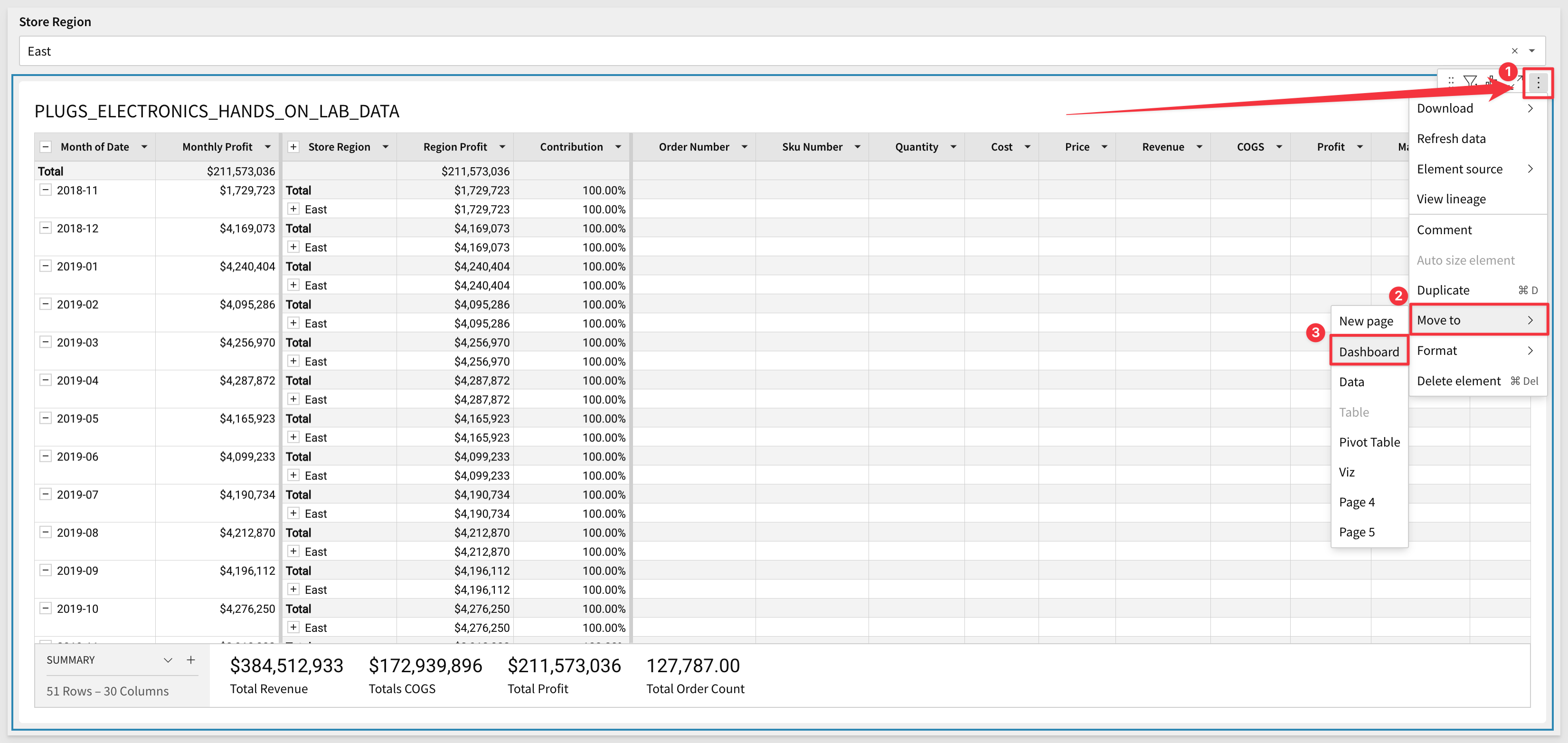
For each Page that has an Element we want to move to the Dashboard, follow the same steps. Navigate to the Tables Page and using the Elements menu, click to move the Table to the Dashboard as shown below:
We moved Elements from the Pages named Tables, Viz, Maps and PivotTable. You may not have all these Pages if you did not complete the other Getting Started QuickStarts. That is ok, the workflow is what we want you to understand and you could build Elements directly on the Dashboard Page anytime too. Sigma is flexible and you can work how you want once you understand some of the options.
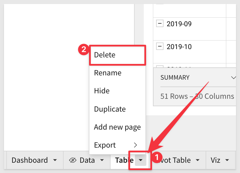
Since we moved Elements (instead of making copies) we don't really need the old Pages so we can delete them but don't delete the "Data" Page as all our Elements reference that.
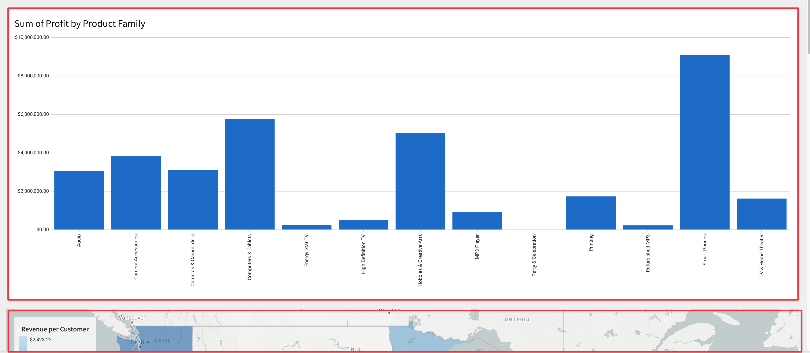
We now have all Elements on the Dashboard page but they laid out full size on top of each other:
Every Element that has been added to a canvas can easily be moved around and arranged in any manner you like.
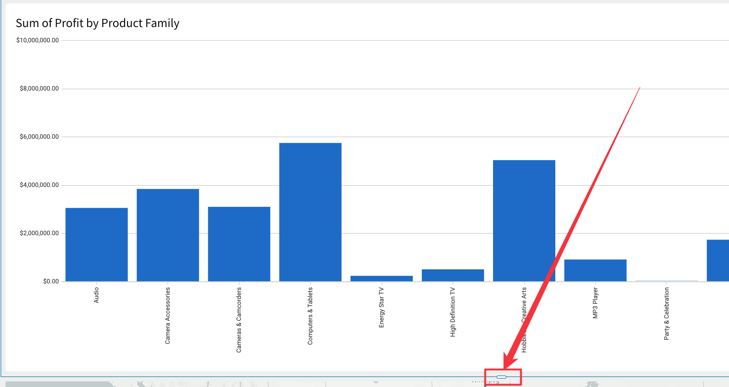
Click anywhere on the Table and you can see a small "grab-bar" in the center of the bottom border. We can grab this and shrink the vertical size of the Table.
You can also move Elements around by clicking to select them and then dragging them around the Canvas to drop them where a black line appears. You will notice a small hand icon that appears (hover over the 3-dot menu on the right top corner of any Element) letting you know you can move an Element.
Drag the two Chart Viz to the top of the page and next to each other as below:
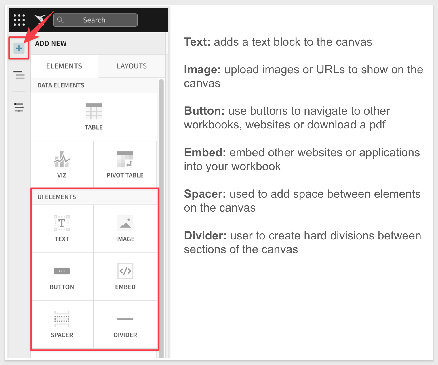
Experiment moving and placing your Elements till you are satisfied. It is easy to adjust the layout of the Canvas to suit your needs by using Canvas Elements. Click the + Add New icon in the Element menu. You will see there are several UI Elements that you can use to adjust and enhance your Dashboard's Canvas:
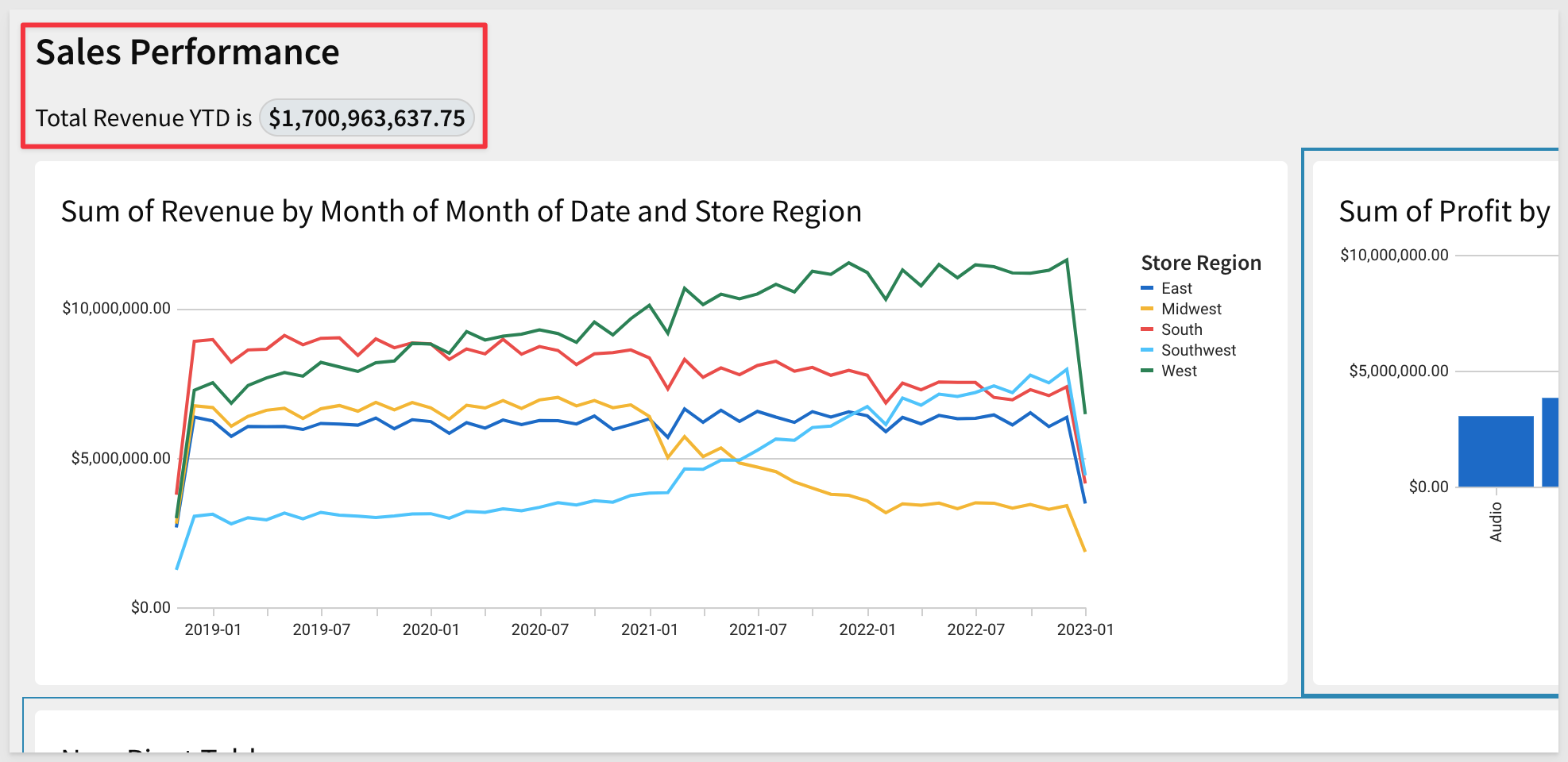
Next, let's give this dashboard some context for our users. Using our Text elements, we can give the page a title, as well as let users know what this dashboard is used for, giving them context.
Clicking the ‘+' icon on the upper left-hand pane next to Page Elements, select Text. This will add a Text box to the canvas. Drag the text box to the top of the canvas and give it the name Sales Performance.
Let's add one more text box and drag it below the title. This time we want to use it to display text and the total revenue. Edit the Text box and type "Total Revenue YTD is" and then type the = sign. This allows you to add an inline formula. Use the formula: `Sum([Plugs Sales/Revenue])'. Hit Enter.
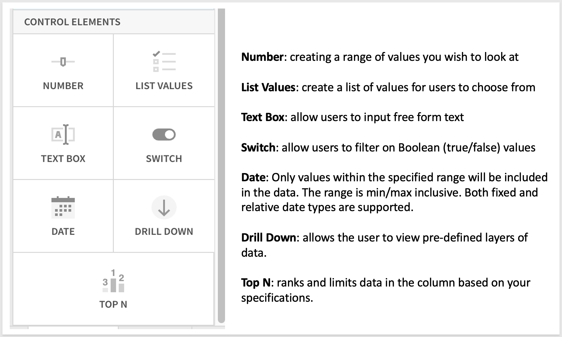
Next let's add a control element to our canvas. Controls enable interactions with the chart such as filter the charts when in use. Clicking the ‘+' icon on the upper left hand pane next to Page Elements, select Date. This will add a Date control to the canvas.
After adding the Date control, let's drag it to the right of the description text box and update the control_id to say Date-Range and update the control label to say Select a Date Range:
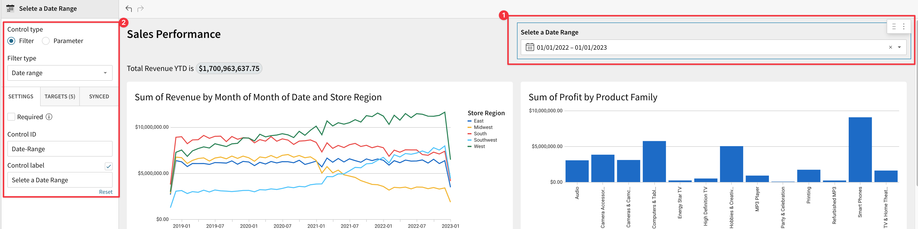
Next we need to tell the control which elements we want the control to apply to.
Clicking on the filter control, we have some options in the left hand pane. Select Targets. Then select Add Target and select our bar chart.
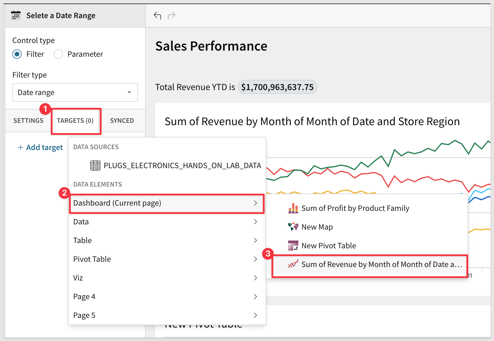
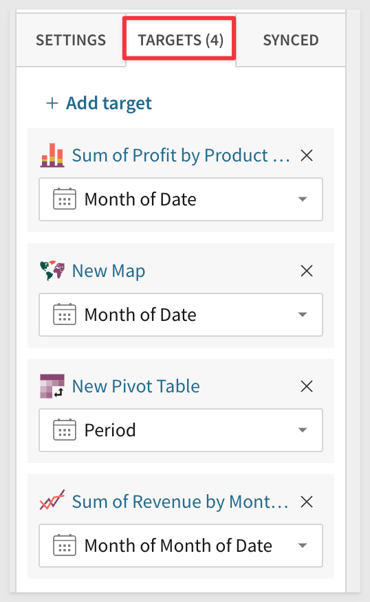
Let's do this for the other Elements on the Dashboard. When done you should have 4 Targets (assuming you have 4 items on your Dashboard) all filter each Elements [date] field.
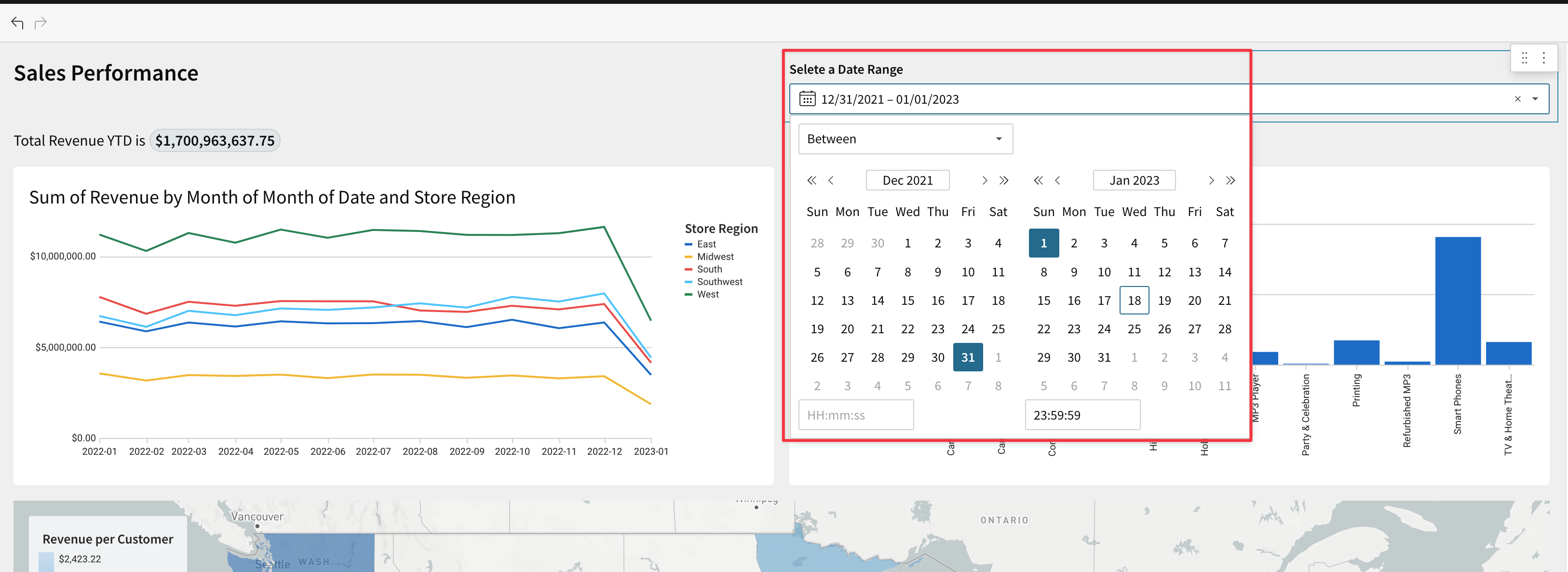
Now users that are interacting with the canvas can use the date control to filter data as they see fit. Below the Date filter is shown set for a 1 year range and the other Page Elements all adjust automatically:
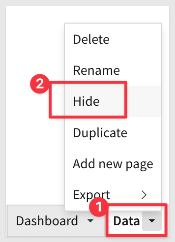
Lastly, before we share this with others, we may not want them to see the data tab from which we are pulling these charts from.
If you click the dropdown in the bottom left hand corner on the "Data" page, we can hide the "Data" page from other users who may be viewing or exploring our dashboard.
Click the dropdown and select Hide.
The Workbook Page label now shows the Page as hidden but we can still see it. This is because we are in Edit mode. Once the Page is Published and viewed, the hidden Pages will not be visible to the user.
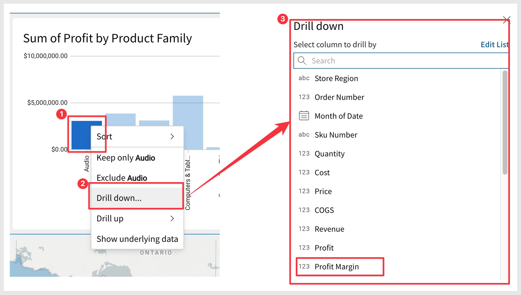
Right Click on one of the bars in the bar chart. Notice that there is a drill-down option? Do you recall configuring this somewhere? We did not; with Sigma users are free to explore in an unconstrained fashion without having to ask for an additional (ad-hoc) report.
After clicking" Drill Down" we are presented on all available data columns...select Profit Margin.
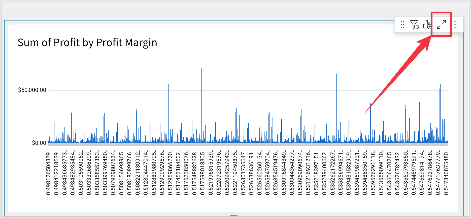
The Chart reorients to show Profit based on Profit Margin:
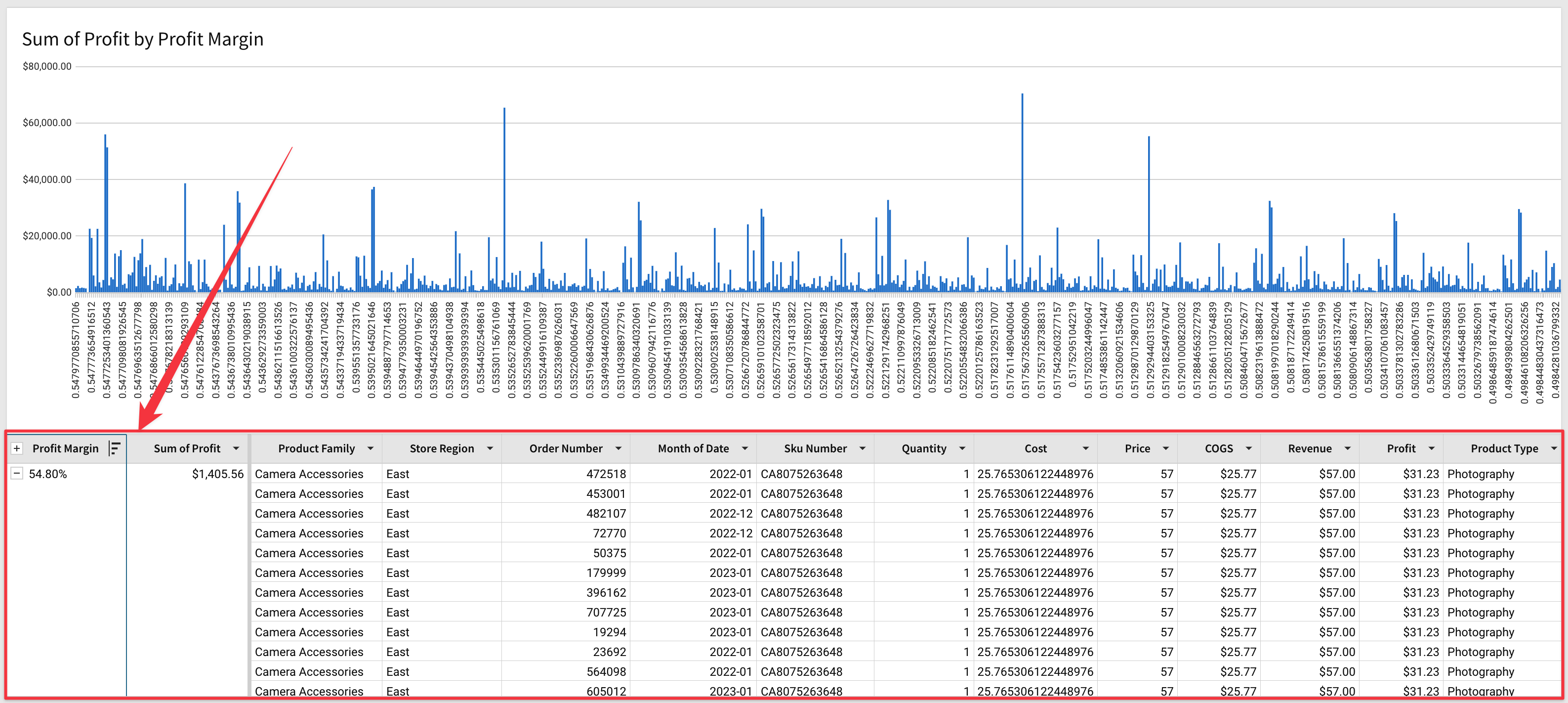
Want to see the row level detail? No problem; just click the arrow icon as shown below and the Chart opens along with the underlying data for further analysis:
We can now see profit margin line item detail:
This QuickStart covered Dashboard basics, building on previous Fundamentals QuickStarts content. We learned how to place Elements on the Dashboard Page, move them around, resize them and add Controls to enhance and filter the Dashboard.
The final product should have looked something like this:
Additional Resource Links
Be sure to check out all the latest developments at Sigma's First Friday Feature page!
Help Center Home
Sigma Community
Sigma Blog